L'Oreal La Couleur Infaillible/Indefectible: Cannes Collection.
L'Oreal released a new collection for the Cannes Film Festival 2012, including some LE shades of their popular cream/powder-hybrid Color Infallibles. i know it feels like a year ago in the beauty-LE-world, but better late than never, huh?
i ordered 4 of them at feelunique.com, if one signed up for some L'Oreal VIP/Insider/blabla-club, a whopping 30%-off for this collection was waiting. the eyeshadows retailed at £6.99 each (they're around 10€ here in germany), i paid about £20 post-discount for all 4 of them.
as always, these contain 3.5g each and come in the plastic pot whose "butt" looks better than its "face" ;) inside, you'll find the funny plastic insert to keep the loosely pressed crumbles in place.
i like the high shimmer of these eyeshadows, they apply without fall-outs and last nicely on the lids.
compared to the Giorgio Armani Eyes To Kill Silk Eyeshadows, another daughter of the L'Oreal group, i find this affordable version to be very similar in quality when swatched, they also have a nice metallic finish and complex multi-coloured glimmer, but when actually applied, the L'Oreal Color Infallibles are often not as brilliant and intense as the GA ETK eyeshadows. they lack some of the initial shimmer and need to be built up. additionally, they don't last as amazingly well on my lids as the GA ones, an eyeshadow primer is needed for perfect staying power. these minor flaws you'll have to face in exchange for the lower price point, but the drugstore line-up also offers a more colourful range.
i don't know if these eyeshadow shades have come or will come to the drugstore, i am totally confused with all their US/europe analogies and differences, so please be geared to my product&swatch photos to compare as i think they display the real colours quite exactly (at least on my macbook screen).
Metallic Lilac
is the most neutral and easy-to-wear shade of today's selection. #037 Metallic Lilac is rather a steel grey with strong purple tinge than a purple, so i like it even more. it contains tons of blue and pink shimmer, you can see some small pink crumbles in the pan. if applied sheerly, the purple sheen is quite strong but when i pack it on, it appears as a cool toned dark silver. no hints of taupe here, so it's a whole other story than Chanel Illusoire or Giorgio Armani ETK #4 Pulp Fiction.
comparison
Chanel Illusion d'Ombre Illusoire - L'Oreal Metallic Lilac - Giorgio Armani Eyes To Kill Silk Eyeshadow #4 Pulp Fiction
Chanel Illusion d'Ombre Illusoire - L'Oreal Metallic Lilac - Giorgio Armani Eyes To Kill Silk Eyeshadow #4 Pulp Fiction
underexposed to show the different iridescent glimmer
tihilw
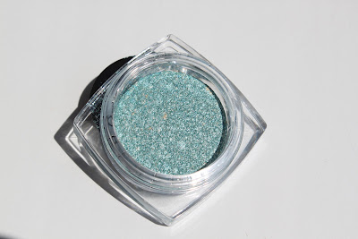
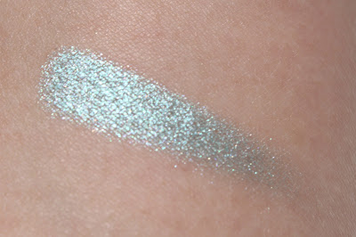
Innocent Turquoise
this shade looked a lot deeper in the preview, i was surprised that it's just a pale baby blue when i saw it in person. but then it quite reminded me of Chanel's latest Illusion d'Ombre in Rivière from their formerly Asia exclusive, now also in the US available collection. in fact i'm not a fan of such light blues, but Kate, the (genius) Driveller turned this colour into the most admirable of this season for me. unfortunately, they don't seem like perfect dupes, but with a little bit of light grey added, i can make this L'Oreal one mimicing Rivière quite well. #031 Innocent Turquoise is a clear light icy blue with lots of blue, white and pale gold shimmers and a frost finish. it contains small light gold and more intense turquoise crumbles but still is a very cool toned colour. applied, it's not as metallic and shimmery as swatched. these colours only work for me if i add some darker shade to the outer corner.
definitely check Kate's series on Drivel About Frivol for look-inspirations (how amazing is look #4?!)
Magnetic Coral
i neither liked nor did i owned candy colours like this, but somehow i was on a run for blush colours on the eyes in the end of spring and so i ended up buying a few peaches and pinks, including #039 Magnetic Coral. it's an orangy coral in the pot with gold and pink crumbles. such a complex colour of peachy coral with gold, blue and pink shimmer - sadly it looses lots of dimension when applied. but still, i really like the satin bright peach on my lids although it's so unfamiliar. i make sure to frame it with darker shades and apply a crisp eyeline to avoid the colour getting directly next to my eyes and emphasizing on any redness so it would make me look sore-eyed.
tihilw
here i was wearing Magnetic Coral on the lids. i added MAC All That Glitters on the inner corner and Chanel Taupe Grisé on the outer V, then dusted a bit of MAC Parfait Amour over it.
Naughty Strawberry
#036 Naughty Strawberry is a frosty blue based pink which contains pale gold crumbles and swatches with pink, blue and gold glimmer. the colour doesn't resemble strawberries at all since there is no detectible warmth of red or coral. this is not a colour i would have normally picked as i find it unmodern and a bit tacky. it's not easy for me to integrate it into a wearable eye make up. but, if not used excessively, it still looks fine in the overall appearance which is surprising to me. again, i can only use a candy pink like this as a lid colour combined with darker shades and an eyeliner.
tihilw
for this look, i applied Naughty Strawberry to the lids, added MAC Retrospeck in the inner corner and lower lashline. on the outer V i'm wearing MAC Contrast and dusted MAC Deep Truth over it for the blue sheen.
together with Forever Pink & Purple Obsession and Sahara Treasure & Bronze Goddess
Libellés : brand: L'OREAL, comparison, eye make up, Eyeshadows, look, swatches


0 commentaires:
Enregistrer un commentaire
Abonnement Publier les commentaires [Atom]
<< Accueil